Single-Community Analytics
Overview
The Single-Community Analytics dashboard provides detailed insights into turnover metrics, job performance, and time-based analytics for a single selected community.
Key Sections and Visualizations
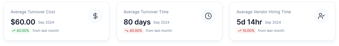
1. Key Performance Indicators
- Average Turnover Cost: Displays the cost associated with turnovers for the selected duration, with a comparison to the previous month.
- Average Turnover Time: Shows the average duration taken for turnovers, highlighting changes from the previous month.
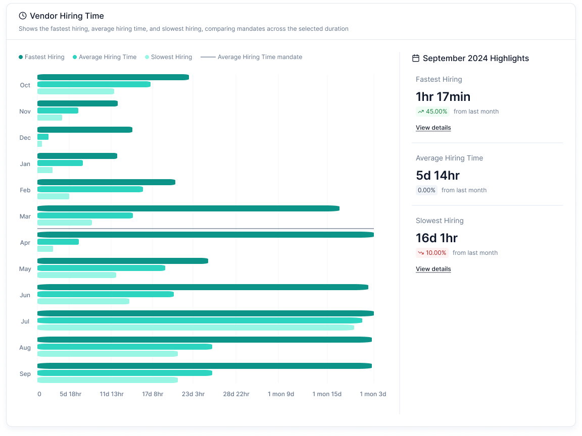
- Average Vendor Hiring Time: Indicates the average time taken to hire vendors, with percentage change from last month.
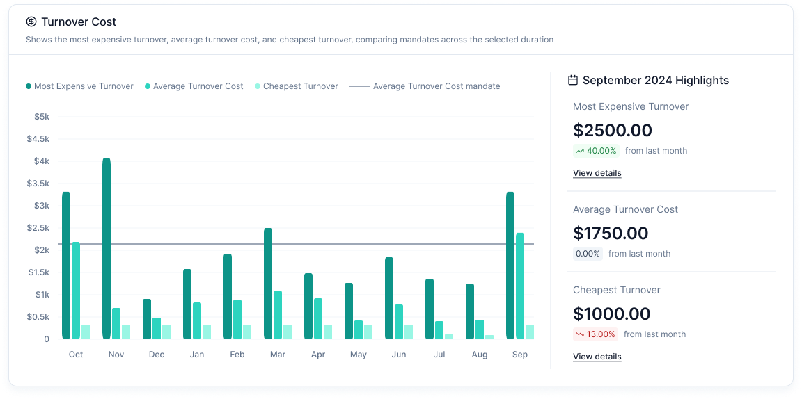
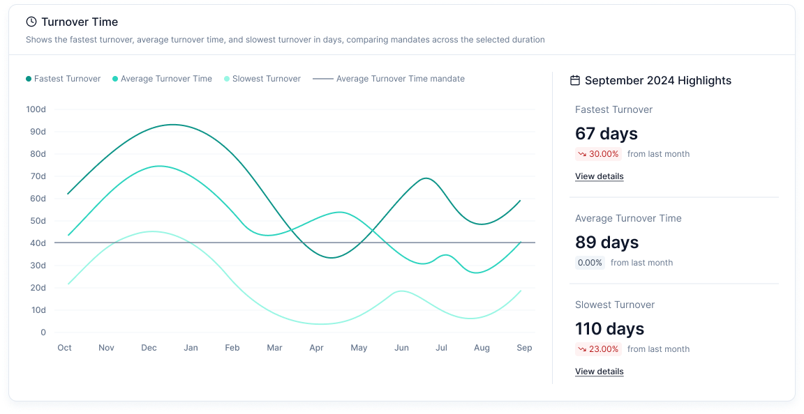
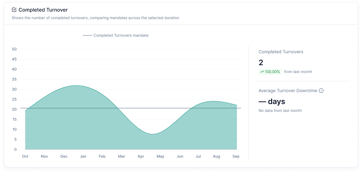
2. Turnover Metrics
-
Turnover Cost Breakdown: Bar charts comparing the most expensive, average, and cheapest turnovers.
-
Turnover Time: This shows the duration taken for turnovers.
-
Completed Turnovers Chart: A line graph showing the number of completed turnovers over time.
3. Job Metrics
-
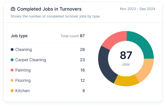
Completed Jobs in Turnovers: Pie chart showing completed jobs by type (e.g., Cleaning, Carpet Cleaning, Painting, Flooring, etc.).
-
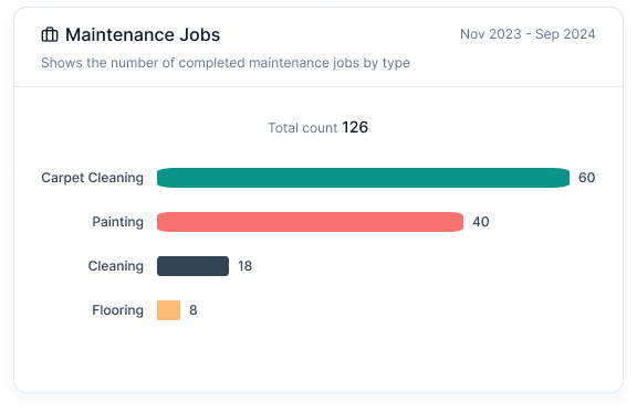
Maintenance Jobs Chart: A bar chart displaying the number of completed maintenance jobs by type.
-
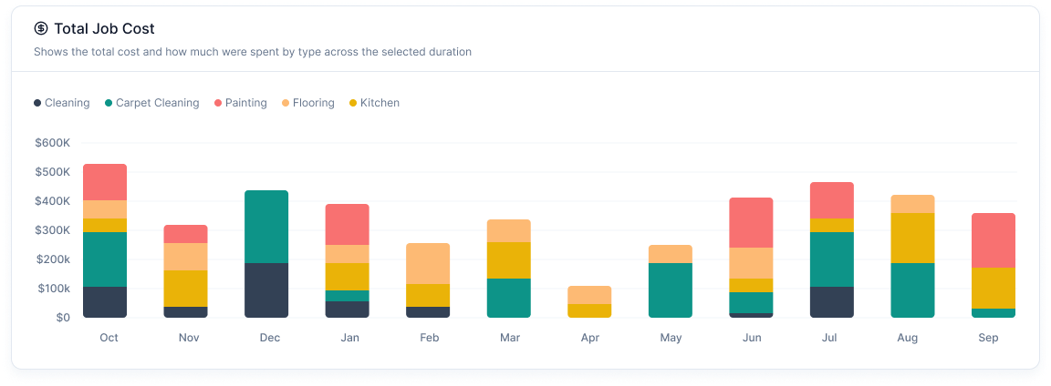
Total Job Cost Chart: A stacked bar chart visualizing the total cost spent per job type over time.
-
Vendor Hiring Time: A bar chart tracking the fastest, average, and slowest hiring times.
-
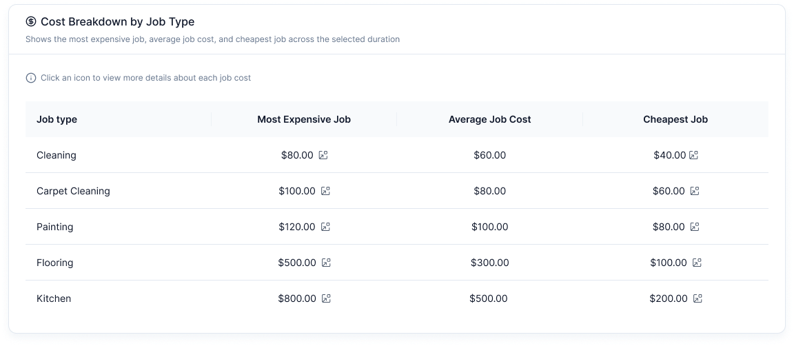
Cost Breakdown by Job Type Table: A tabular breakdown of the most expensive, average, and cheapest job costs.
4. Highlights
- Last Month Highlights: Displays the corresponding data from the previous months from the selected date.
- Visual Indicators: Color-coded markers indicate improvements or declines in key metrics.
- Clickable Details: Users can click the view details button in highlighted metrics to access a detailed breakdown.
Features
- Date Range Selection: Allows users to filter data within specific timeframes.
- Community Selection: Users can switch between different communities.
- Export Options: Enables downloading of insights for external reporting.
- Interactive Charts: Hover-based insights for deeper understanding.
How to Use
- Select a Community to analyze specific data.
- Set a Date Range for the period of interest.
- Review Turnover & Job Cost and Time through charts and tables.
- Export Data if required for further analysis.